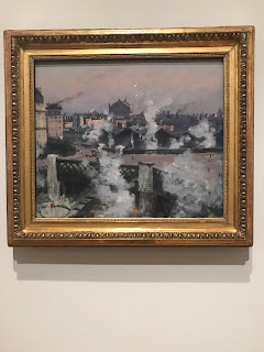
My favorite piece from the BMA was Dancer at Pigalle's by Gino Severini.
The composition of this piece was interesting. There were lines all throughout the painting pointing you to the dancer that is in the middle. There are a lot of organic shapes that are used in this piece, along with a lot of texture. It can't be seen in this photo, but there are thing that are actually raised off the page slightly. To me, this looked like a moving dancer. I felt like it was probably to an upbeat song but also elegant. It seemed like it was in the middle of the dance and while the dancer was in motion. I thought that the bottom part of the painting was the audience. Its darker than the rest of the painting which could represent all of the people that are sitting in the crowd and how it just looks like a dark blob. There also looks like there might be some people that are standing because of how it kind of goes up and down and not just a line that is straight across at the bottom of the page. I also think this is in the middle of the dance because there are light yellow/white lines that are coming down at the top of the page into the middle that looks like spot lights on the dancer.
#2
My second favorite was Large Fish with a Cliff by Henri Matisse
This painting uses dots in order to give things in the painting texture. It also uses dull colors to set the tone for the picture. This seemed like this was at sunset possibly on a small private beach. It doesn't look like it is a big beach and I cant picture it being much more beach behind us where we can't see. When you're look at this picture you almost feel like you are standing on this beach because of the way the dead fish are laid. They are in a position where it almost looks like you are looking down on them or standing right next to them. I almost imagine this beach being in California. The colors and the dead fish kind of make it seem like there is not something happy going on in this picture. Maybe the people in the picture are planning on cooking and eating those fish and that is why they are laid out on something. Or maybe they just got washed up to land.
#3
My third favorite painting was View of St Lazare Railway Station, Paris by Norbert Goeneutte
This painting looks like a photograph when you first look at it in a way. There are a lot of lines that seem to pointing to one building in the middle of the painting however, they are not straight lines, it is the smoke lines from the trains. This picture seems like it is early in the morning as the sun is rising and everyone is going to work. It feels like it is during a depressing time, I imagine the Great Depression for some reason when I am looking at this photo. Also, the smoke from the trains and the trains in the stop make it seem like everyone is off to work. Putting yourself in this painting, it feels like you are at a window looking out into the town.


No comments:
Post a Comment